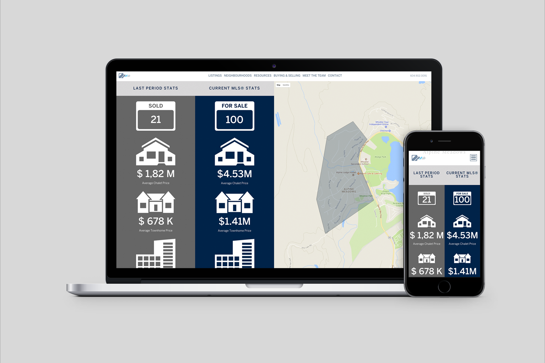
Less is more is truer than ever in today’s digital world as software and app interfaces are effectively employing a minimalist design. Website design has shifted from the antiquated 3-D and skeuomorphic (digital objects resembling their real-life counterparts) to the simple and flat. A few reasons why:
. . . .
Information Overload
The world is increasingly small as advanced technology permits us to connect with the touch of our smart phone screens. While this is a great advantage, we often become overwhelmed. Reduction of clutter therefore creates a sense of order and tranquility for the user interface. Simple alignment makes it easy for the user to follow the interface’s structure. “Reducing the visual palette supports a more complex structure without feeling messy (Taylor, 2013).”
Clear Content
It is all about the content after all. Making sure the overall message is emphasized and that there are no distracting interfaces in the way is important. Everything should intuitively lead to the content.
Boost your rankings
While responsive design does not lend itself to a certain look, it does direct the website to have a minimalist design, which contributes to page weight reduction and load time. As a result, mobile experience is drastically improved which creates a boost in the number of visitors and visit duration of a website. According to the Brixwork Blog, 1/3 of visitors to real estate websites are from mobile phones or tablets. Responsive design also has SEO implications, as more users are resorting to their mobile devices to search for websites on the go. Google has begun to prioritize mobile-responsive websites over those that are not in their search rankings, as reported in the article on Real Estate Websites and Mobile Responsive Sites. Jeff Kee has made that a main focus for Brixwork Real Estate Websites which has been offering mobile-responsive websites for years already.


